
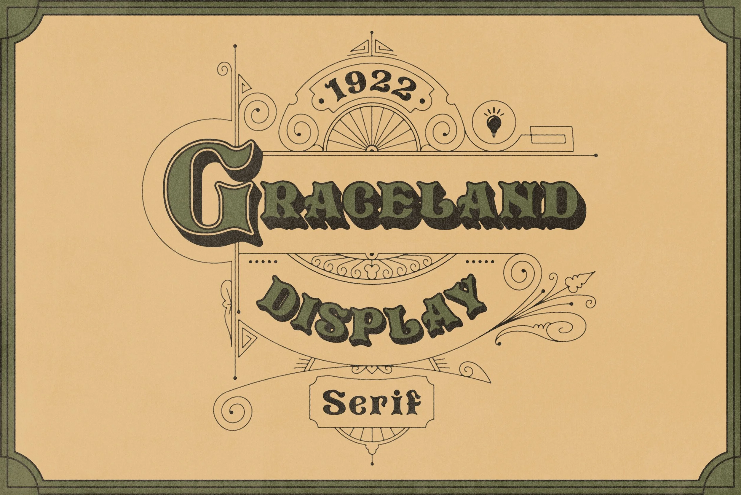
GRACELAND VINTAGE DISPLAY TYPEFACE
Graceland Display is a vintage typeface that models it’s looks after late 1800’s to mid 1920’s hand drawn type. It features bone serifs, thick weighted lines mixed with dramatic flourished accents. This typeface is a blast to use and would make a great edition to anyones collection. You can pick up a copy for yourself from Creative Market by clicking HERE!
SERVICES RENDERED
Type Design
Illustration

CHARACTERS
This typeface includes swooping dramatic capital letters paired with equally flourished medium lowercase letters. It also includes a full number set for all of your numeral needs. The serifs on many of the letters resemble the ends of bones. I’m excited to see what you create with this set so make sure you tag me in your work!

BEHIND THE NAME
This typeface was named after the Graceland Cemetery in Chicago. Graceland was established in 1860 by Thomas Bryan, a lawyer with a successful Chicago practice. He purchased its original 80 acres and received a perpetual charter from Illinois in 1861, and soon hired prominent landscape architect H.W.S. Cleveland to plan its park-like ambiance. Notable burials in the cemetery include Ernie Banks, Louis Sullivan, William Hulbert, Potter Palmer, George Pullman, Cyrus McCormick, Marshall Field, Allan Pinkerton, Jack Johnson, Luwig Mies van der Rohe and many others. Like all of my typefaces, this one continues the naming tradition of important places, buildings and monuments in my childhood hometown of Chicago.
