MONADNOCK VINTAGE DISPLAY TYPEFACE
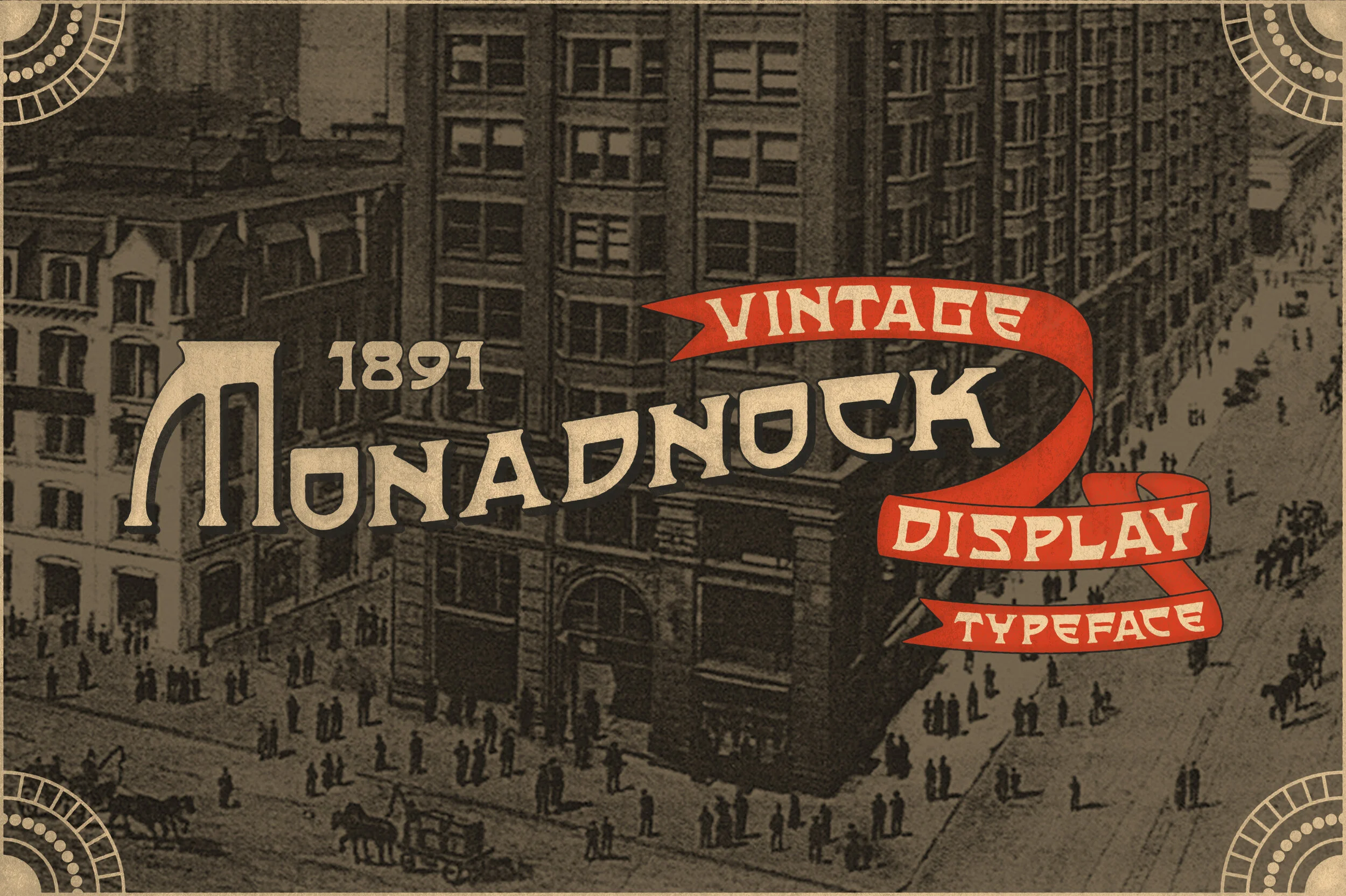
Monadnock Display is a vintage typeface that models it’s looks after late 1800’s to early 1900’s hand drawn type. It features sturdy looking thick lines mixed with dramatic curved corners. This typeface is a blast to use and would make a great edition to anyones collection. You can pick up a copy for yourself from Creative Market by clicking HERE!
SERVICES RENDERED
Type Design
Illustration
CHARACTERS
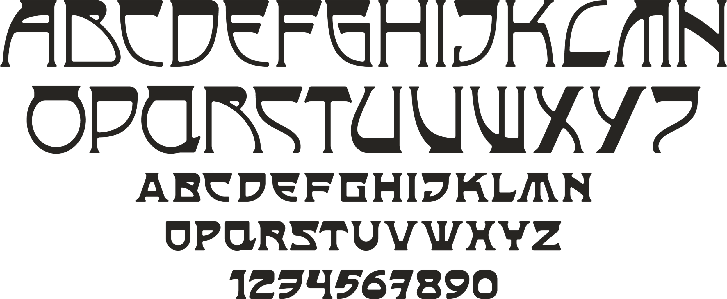
This typeface includes large dramatic (all caps) capital letters paired with medium (all caps) lowercase letters. It also includes a full number set for all of your numeral needs. The serifs on the tops of many of the capital letters resembles the roof of the Monadnock Building. I’m excited to see what you create with this set so make sure you tag me in your work!
BEHIND THE NAME
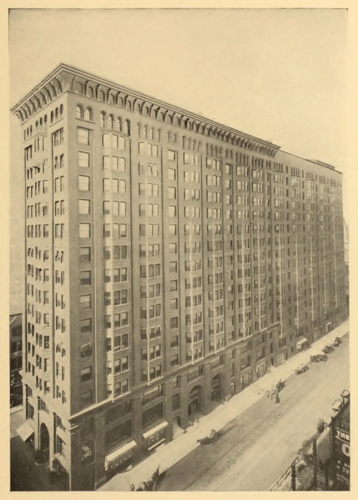
This typeface was named after the Monadnock Building which is a 16-story skyscraper located at 53 West Jackson Boulevard in the South Loop area of Chicago. The north half of the building was designed by the firm of Burnham & Root and built starting in 1891. The tallest load-bearing brick building ever constructed, it employed the first portal system of wind bracing in America. Its decorative staircases represent the first structural use of aluminum in building construction. The south half, constructed in 1893, was designed by Holabird & Roche and is similar in color and profile to the original, but the design is more traditionally ornate. When completed, it was the largest office building in the world. The success of the building was the catalyst for an important new business center at the southern end of the Loop. Like all of my typefaces, this one continues the naming tradition of important places, buildings and monuments in Chicago.


